Product managers need to have a wide set of abilities – understanding good user experience is a particularly important one to have. One of the most valuable competencies I ever learned was to prototype. This helped me to better understand how products and product features decompose into screens and elements.
It also helped me to quickly incorporate the UX flow much earlier into my thinking.
In this post, I want to take you through the anatomy of a real life prototyping project of mine. I will share the company context, the goal and every single prototype screen that was created – all the way from paper to final app. The outcome is that you will not just see a prototype but you will get a look inside a prototyping project and I think that’s a valuable insight to have.
The Taxeo Project
TAXEO was a company that I consulted with. Their business objective was to allow business travelers to automatically retrieve any VAT paid in their hotels, car hire etc. In order to do this, they signed up hotels and car rental companies to be part of the TAXEO network. The next step was to build an app so the traveler could retrieve their TAXEO ID, see nearby hotels, make a booking with these hotels, see hotel details etc in the knowledge that this hotel would automatically send electronic data to TAXEO from the hotel booking system in the right format for all the VAT to be reclaimed automatically by TAXEO and refunded to the customer.
This app design and build was a 3 month project from first paper prototype to the app going live in the app store. The speed and success of delivery this project so quickly was due in no small part to the fact that the use of prototypes helped everyone visualize and agree on what needed to be built before we started. It also helped the development team to know exactly what was required.
My recommended approach is:
- To first build a prototype using pen and paper (just for yourself)
- Build a digital wireframe – so the team and stakeholders can align on what is to be built
- Build a full graphic design wireframe
Three Phases
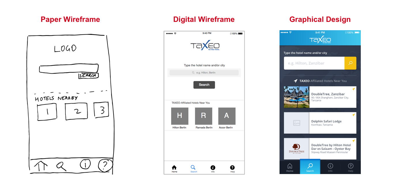
Here is a little sneak peak into the future.
These are examples of one screen from each prototype I built (paper, black-and-white digital and full graphic design color digital prototypes). A quick glance can show you how the designs evolved over time.
Step 1: Paper Prototyping
I created first some screens on paper. They really looked like they were drawn by a four year old! The point is that I was able to quickly figure out how many screens there were and what were the major elements on each screen.
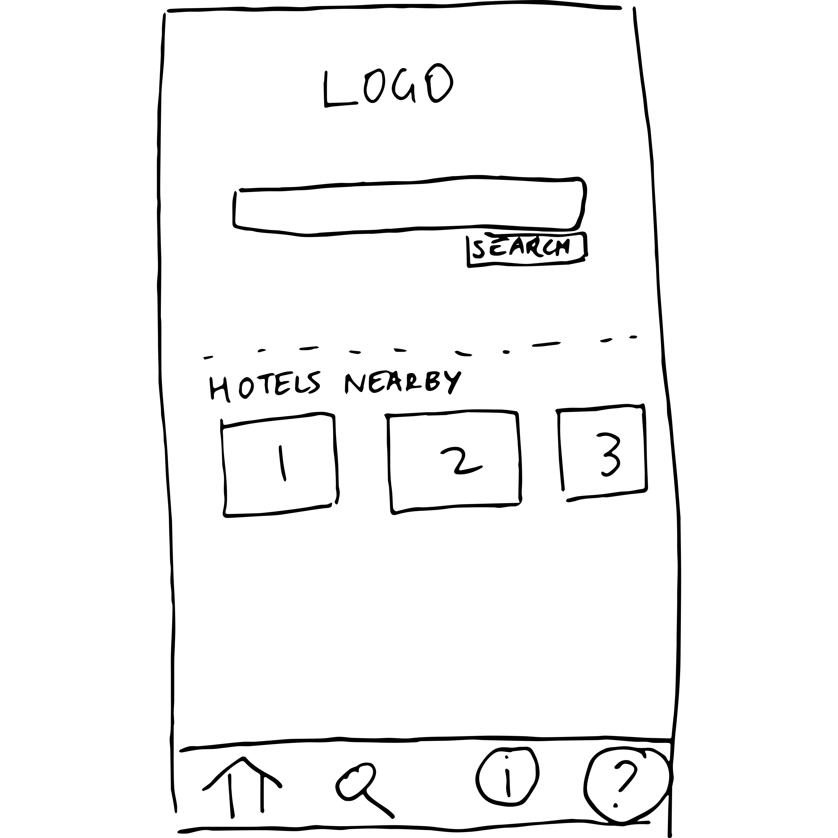
It is true that many times I crumpled up a piece of paper and threw it in the corner. But then to do a new version once I realized there was a problem somewhere was often just 10 or 15 minutes. I find that certain issues (particularly those involving the flow of screens) are only discovered when you actually see them linked together or try to link them together. Paper prototyping really helps you find these issues!
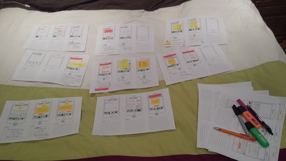
The very first prototype that you do is really for yourself. It is to get your own thoughts straight and to be able to create a few different versions of something to see what you like. It’s important to be able to quickly visualize several possibilities and to see what works the best. A 2-3 hour session can get you a long way, and your table may look a bit like the image below!
Once you have all the screens sketched on paper, then you need to create a prototype. You can use the Prototyping on Paper (or POP) app – an extremely lightweight and easy-to-use prototyping tool which is created by a company called Marvel (works on Android and iOS)
Sketch some screens on paper
Install and open the POP app
Create a project in POP and add images (take photos of your paper sketches)
Link them together by adding some hotspots (hotspots are just an area that we tell our prototyping tool is a link to another screen! By creating a hotspot, we link two screens).
Here is a link to the final paper prototype!
Step 2: Black & White Digital Version
The next thing that I want to do is to create a black-and-white version of each screen which shows the major elements on each screen. This is an ideal level of detail for aligning the major stakeholders (including decision-makers and the tech team) so that we are all clear and in agreement about what we are going to build and why. Prototypes are invaluable for achieving this alignment.
I design these screens in Sketch. I can’t recommend learning to use Sketch enough. It’s a wonderful tool – like an easy to useHave a look at the screen below:
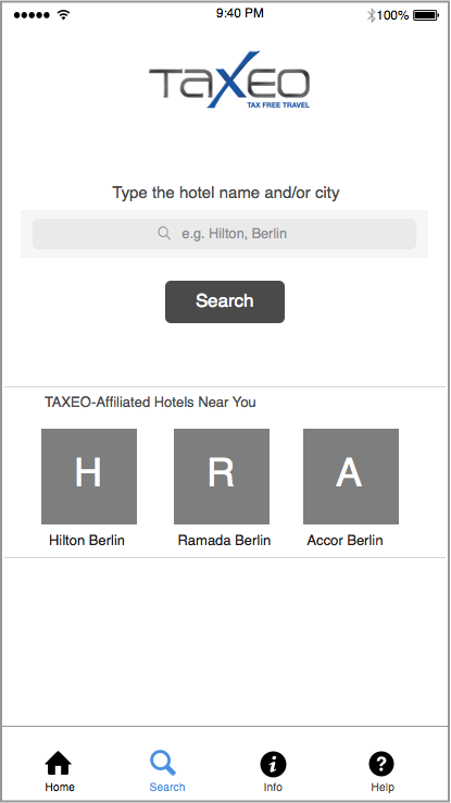
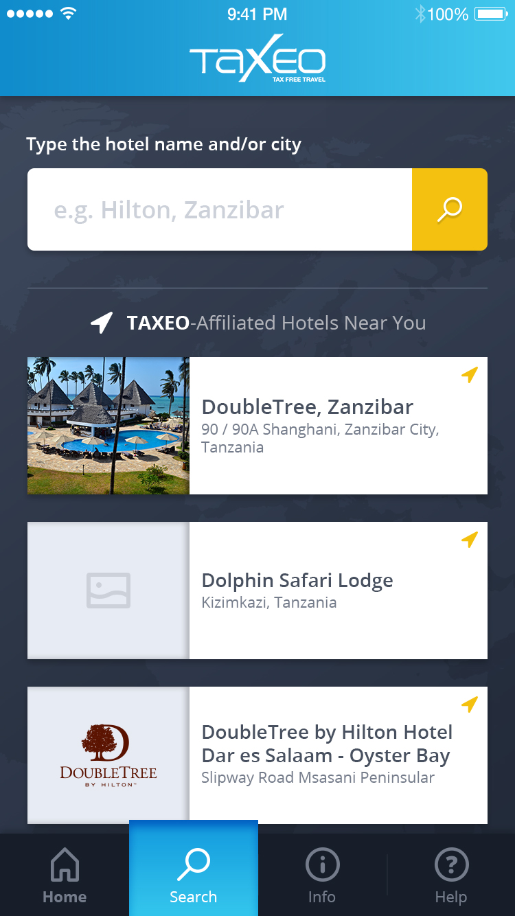
You might notice here that instead of using an image for ‘Hilton Berlin’, I just use a rectangle with a H in it. This is deliberate – I don’t want a conversation about whether the image is suitable, whether the image is too big, whether the image should have a border etc. It’s not that such a conversation won’t happen eventually – but such details are not important now. What is important is that this screen has a search form and then underneath we show the three closest hotels. If we want to talk about whether we should not show the closest hotels for some reason, that is the kind of conversation we should have right now!
Once I have designed the screens, I drag and drop them into InVision and add links (hotspots) to each screen so that the screens ‘link’ together and the flow of moving from one screen to another can be experienced.
If you want to see the full prototype, you can click here. Note that you might want to open this on mobile to get a real feel of how the prototype is meant to be experienced (but it’s fine to open it on a desktop if you wish!)
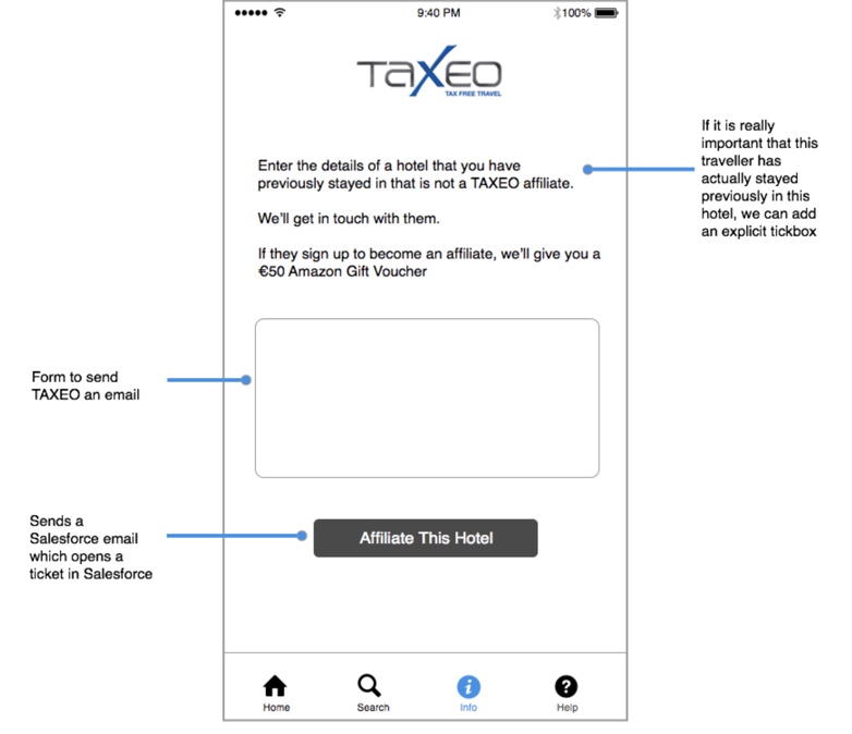
Step 3: Black & White Digital Version with annotations
Because I am communicating with internal stakeholders and the tech team, it is also useful to create a version that features some annotations.
This will help the stakeholders and tech team to understand some of the major interaction logic that lies behind the design – for example if the user clicks to “affiliate this hotel”, the app will open a ticket in Salesforce and send an email. Explaining this now can prevent a lot of people in the team asking many questions. Questions by themselves are not bad – but it can be time consuming to receive long emails with a long numbered list of questions. Where possible, if we can annotate so that fewer questions arise about ‘how this works’, then that’s a good thing!
You can see a full prototoype with annotations here. (I recommend opening this prototype in desktop)
Step 4: Full Graphic Design Digital Version
Only once the team is fully aligned do we move on to full graphic designs (screens that actually look like what the final app will look like!). Fully aligned means the whole team is in agreement on:
- How many screens there are
- What the major elements are on each screen
- How the screens flow and connect together
Once this alignment has been achieved, then the graphic designers on the team can begin work on the full graphic designs.
As you can see, some presentation elements have changed. The three closest hotels are no longer one row with three columns but are one column with three rows. It’s fine for enhancements like this to be made (after all the information fits better this way!) but this doesn’t compromise what we built or how it works (rather how we present it has changed slightly!)
If you want to see a full color final prototype (which is exactly how the app works) then click here.
Summary
- To get to the point where you feel comfortable with a v1 set of screens that link together well, create a paper prototype with paper and using POP app to link them
- To get to the point where the whole team has made the right decisions about scope, how many screens, what the back-end functionality will be, do a black and white set of designs using Sketch and InVision. Do an annotated version too to reduce the questions.
- To get to the point where the app can be finished, do a full set of graphic designs and create an InVision prototype so that the guys working on the design can see the details and testers can test with this prototype.
This is a prototype project life cycle – the TAXEO app went through this whole cycle and live on the iTunes and Play store in 3 months – largely because of the shared understanding of the team and the communication being excellent with our use of prototypes.
If you have any comments, leave them below. Have you worked on a project and done things differently? How did it work out?