It’s Not Technical
Being a product guy for over ten years now, I have seen countless times how a picture is worth a 1000 words. The real challenge in building software isn’t technical; everything can technically be built. The real challenge is in communication.
Gojko Adzic describes it beautifully when he describes the process between the stakeholders, the product team, the developers and testers as being akin to a game of chinese whispers. Each time you pass on a message, it gets translated and interpreted. People interpret what you tell them by relating that to something in their past experience. How similar it is to something already understood, or something that happened in the past is how people essentially understand what you’re trying to tell them today.
So when I met Henk (founder of OutsourcingHub) and he was describing his vision to me; how the broken world of IT outsourcing could be fixed, I was hooked. I had been involved in the process of RFIs and RFPs; I knew we could do better. Henk’s extensive network of IT providers were already showing huge interest, despite the fact he had no product. They knew that had this ‘pain’ and that they would surely pay if someone had the right ‘medicine’.
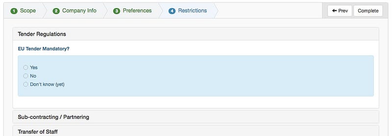
The first step for me was to get something visual, so I started to build a demo of what the site would look like. Instantly, I faced a huge UX challenge: the amount of information that would have to be supplied by each provider would be vast. How to structure that information capture in a form baked my noodle for a couple of weeks until I managed to embed some expanders within a multi-tab wizard using just html and bootstrap. This gave us a structure of four major sections (across the top) with the sub-sections underneath in expandable areas that meant not too much information was on the screen at any one time.

The choice of building an actual front-end (admittedly that did not talk to a back-end) was deliberate and vitally important. We wanted to put people in front of this demo and get them to fill in their information. It had to feel real. We captured the data entry in excel at the same time as the first users were using the form. However, the fact that is passed for real meant that the level of concentration and focus from the users was what it needed to be. When a question was too limiting, users were frustrated. When a question was spot-on, users were delighted. When something was missing, people told us. And when the javascript closed something too quickly, people told us.
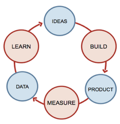
The entire approach to product development was lean. We learned so much in weeks that would have taken years if we just built the system first and then did our learning. Our providers were extremely willing participants, they are an intelligent bunch so they got it when we explained that we were taking a lean approach and their feedback was really important. And it was really important, we may well have fixed ten things between showing the demo on a monday and the following thursday. It’s this speed of learning that makes products tick.
My favourite book on customer development (The Mom Test by Rob Fitzpatrick) mentions that you can only take feedback seriously if the (potential) customer you are talking to gives you one of three types of ‘currency’; money, time or reputation (like a recommendation). In all my years of customer development, nothing could be more true. I have had so many times when people were telling me that they really really loved my product idea or screenshots that visibly changed state when I asked who else might use this and would they consider putting me in touch. They were being polite (which I understand) rather than factual and then had to retreat from giving me a currency such as recommendations.
What an interactive demo will give you is this; people will give you their time to interact with it. Watch closely. Do they go the whole way? Do they get bored? Do they get stuck? Are they happy? Frustrated? If someone is still using your interactive demo ten minutes later, and enjoying exploring every clickable element, then you can take that as real currency. What this person says really does matter.
Of course, the primary benefit is a visual tool. Much better than explaining abstract concepts to someone, you can show them. A picture is worth a thousand words. But when the picture is clickable, perhaps it’s worth a million.
